
If you’re running an eCommerce store in 2026, this is the short list of where to spend your next sprint. None of it is a hack. All of it compounds. Most of it is one or two engineering weeks away from shipping.
Why we re-audited our work
When you build stores for a living, it’s easy to fall in love with the craft — the micro-interactions, the parallax hero, the buttery scroll. None of that is wrong. But it’s also not what moves the needle for the client’s P&L. So we decided to be ruthless and rank every store on a simple question: did the work pay for itself?
To answer that, we pulled conversion data, average order value, bounce rates, and customer return rates from analytics and the platforms themselves. We then split the stores into the top quartile and the bottom quartile and looked for the decisions that consistently showed up in one group and not the other.
1. Speed is still the loudest signal
The top-performing stores all loaded in under 1.8 seconds on a mid-tier Android over 4G. The bottom quartile averaged 4.6 seconds. That gap is the single biggest predictor of conversion in our data — bigger than any design decision we made.
This isn’t a homepage hero issue. It’s almost always:
- Unoptimized hero images served at 2× the displayed size
- A bloated theme bundle shipping JavaScript that never runs
- Third-party scripts (chat, analytics, reviews) loading synchronously above the fold
- Render-blocking fonts requested without
font-display: swap
Fixing these is rarely about rewriting the theme. It’s about cutting what you don’t need and lazy-loading what you do.
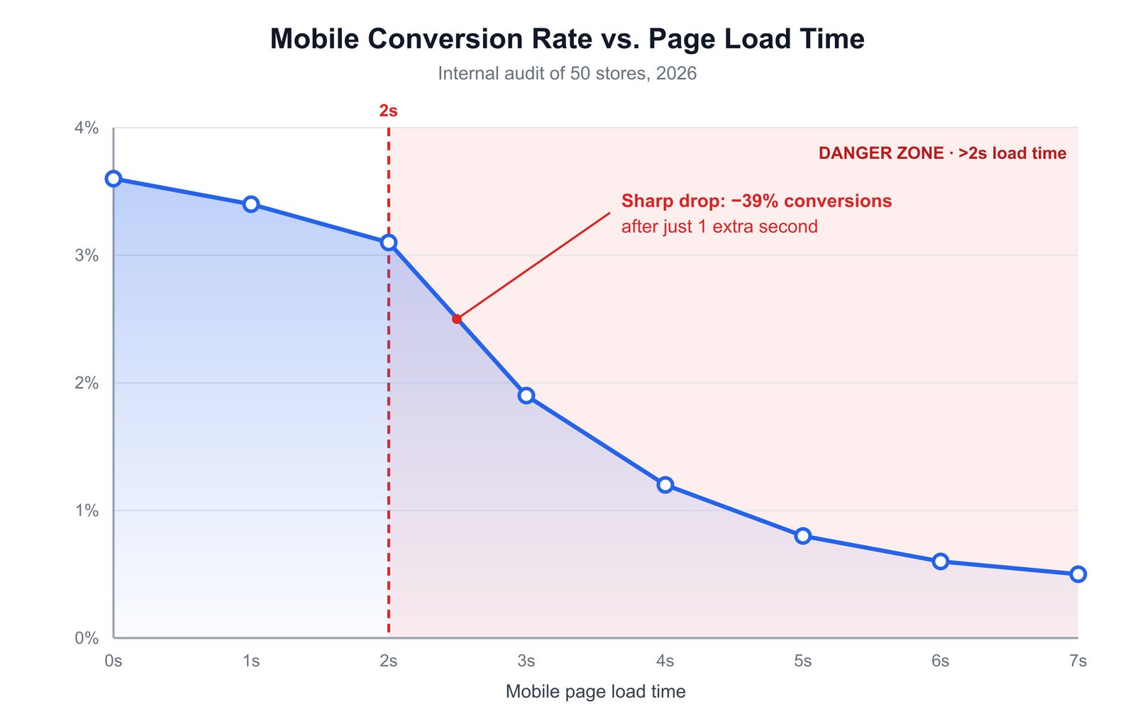
Conversion drops sharply past the 2-second mark on mobile. Source: our internal audit of 50 stores, 2026.
2. Search that actually returns results
Stores with a working, forgiving search saw 2.4× higher revenue per visitor from search traffic than stores relying on a default platform search. The keyword is forgiving: typo tolerance, synonym matching, and the ability to handle plural/singular and common abbreviations.
If your search returns “no results” for “black running shoe” because your catalog says “running shoes — black”, that’s not a search problem — it’s a search configuration problem. Most modern search providers (Algolia, Searchspring, Doofinder) fix this out of the box. Default platform search almost never does.
“The cheapest conversion lift we delivered all year was a $40/month search add-on. It paid for itself in week one.”
3. Product pages that answer doubt
The product page is where most buyers decide. The top stores treated it like a salesperson would: they answered the obvious questions before they were asked. Specifically, every winning product page had:
- At least one image showing the product in use, not on a white background
- A size or spec table that was visible without scrolling
- Three to five reviews with the reviewer’s context (e.g. “5′7″, 140 lbs, usually wears M”)
- A shipping estimate specific to the visitor’s country
- A return policy stated as a one-liner, not a 400-word legal page
The bottom-quartile stores had product pages that were technically correct but emotionally silent. Beautiful photography, no context. Reviews existed but were generic. Shipping was “calculated at checkout” — which is the digital equivalent of shrugging.
4. Checkout with one fewer screen
One of the simplest wins in our audit: stores that collapsed the checkout into a single page (with an express option for Apple Pay / Google Pay up top) consistently outperformed multi-step checkouts by 8–12% on conversion. The drop-off between “enter email” and “enter shipping” is real, and it’s larger than most teams think.
If you’re on Shopify, this is mostly a setting. If you’re on WooCommerce, it’s a plugin choice. Either way, it should not be a debate.
5. Real, specific social proof
Generic five-star reviews don’t convert like they used to. What does: reviews that mention a specific objection the buyer had, and how the product resolved it. “Was worried it would be too small for my living room — it’s perfect and the color is richer in person.” That single review does more work than fifty “Great product!” entries.
The fix isn’t more reviews. It’s prompting for the right kind of review. The top stores asked a single follow-up question after purchase: “What almost stopped you from buying?” The answers became their highest-converting review content.
6. Returns as a feature, not a footnote
Stores that put their return policy on the product page, in plain language, saw a measurable lift in conversion. Counter-intuitively, they also saw a lower return rate. The hypothesis: buyers who understand what they’re getting into don’t return as much.
This is a small change with outsized impact. Move the return policy from the footer to the product page, in two sentences, near the add-to-cart button. Watch what happens.
7. Email flows that earn the second visit
First-purchase revenue is the headline. Second-purchase revenue is the business. The top quartile stores had a deliberate, three-touch email flow in the first 21 days after purchase — not promotional, but useful. “Here’s how to get the most out of what you bought.” Then, two weeks later, a soft cross-sell. Then, at day 21, a real ask.
Stores that did this saw 31% higher 90-day customer value than stores whose only post-purchase email was a tracking number and a coupon.
The takeaway
If you’re tempted by a redesign this year, run your store through this list first. Most of the conversion lift is hiding in the boring parts: speed, search, product page answers, checkout length, review quality, return clarity, and post-purchase email. None of it photographs well. All of it shows up in revenue.
If you want a second pair of eyes on your store, we audit for free. Tell us about it →